An exciting, challenging and promising 2014 is in store for medical marketing. As a new health care landscape takes shape, Armada Medical is positioned stay ahead of the game, starting with a branding update.
The Armada Medical Marketing 2014 update better reflects what our brand actually delivers. We’re still an agency with an arsenal of marketing firepower, but one that is agilely maneuvering our clients through the turbulent seas of restrictions, regulations and guidelines that impact medical marketing.
As we describe in our opening webpage statement, we understand that highly skeptical and time-challenged audiences require more precisely targeted, persuasive and intelligent messages than ever before—and it was time to update our brand to better reflect that we are uniquely positioned to do just that.
![]() The Brand
The Brand
Originally developed in 2002, the Armada brand depicted a traditional “fleet” of ships. This represented the arsenal of health care marketing power and resources that our agency could deliver for our clients. However, the image, style and technology behind the original brand were becoming dated and stale.
Our more modern, streamlined brand identity reflects the forward momentum and continuous innovation that we provide to our clients, helping them prevail over the confusion, the competitors and even the complacency that can reach into the very soul of medical marketing.
The new logo maintains a tie to our original logo and its well-established branding — something our clients and business prospects still recognize as Armada. We kept the original font and removed the drop shadow to further simplify the image. We have also updated the color palette to greens and blues, which are often associated with healing, dependability and freshness. These attributes resonate with sellers and consumers of health care products and services, and are meaningful to health care professionals and their patients.
 The Website
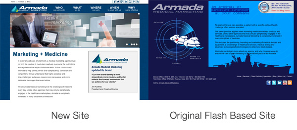
With the new logo finalized, our next task was to update the website with the new branding. Because the old site included flash-based moving parts and navigation, and since flash is no longer supported on many mobile and tablet devices, a total redesign was in order.
The result is a new, fully updated and responsive Armada Medical website that is easily viewed on mobile and tablet devices, as well as traditional desktops. The content has been reorganized so that navigation is easier to see and simpler to use. We shifted the focus from the ship theme to a large, rotating banner of our agency’s strengths. The result is a site that’s much cleaner, easier to read and navigate, and more modern looking in coordination with the updated visual branding.
Home Page Scroller
Included in the website redesign is a home page scroller that moves though the major sections of the website. This provides clearly visible and instant access to the most important sections of the site, enabling the visitor to quickly discover what we’re all about.
 The Portfolio
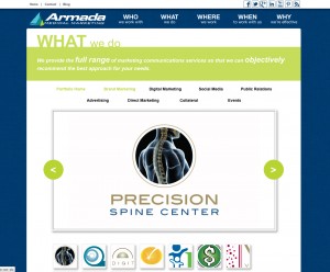
The portfolio section of the Armada website also underwent a significant update. The old flash-based technology called up another smaller window on the website, making the images smaller and harder to navigate.
The new section includes a java script portfolio that is responsive (resizes to the users screen) and has our service categories across the top for ease of navigation, with thumbnails below for quick and easy viewing of our work samples.
Team Page
We’ve also added a new “meet our team” feature. This may seem like a small addition, but we wanted our clients to feel more connected to us and know the team that is working hard for their company. Visitors can now put a face to the name, and the page comes with a surprise roll-over option to let visitors know we are an intelligent and hard working – but also fun – group to work with!
The Other Stuff
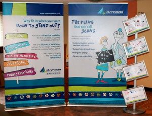
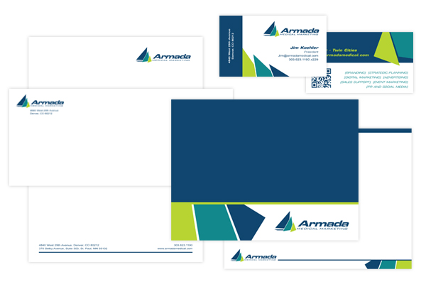
Of course, after updating our logo and website, our job was still not done. After the rebranding and website updates, all of the agency’s marketing collateral was updated to make sure our new brand was consistent in all of our communications both external and internal.
We hope you enjoy our refreshed new look as we sail through the changing world of medical marketing, experiencing the challenges and rewards of amazing services and incredible technology every day.