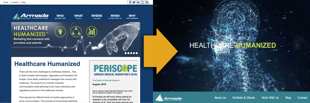
Armada last launched an updated website in 2013… and in the blink of an eye it was 2019 and time for an upgrade once again!

Actually our upgrade was overdue. With the way technology and programing language is rapidly changing, it is best practice to revamp a website every 3-4 years. Not only do design trends change – a new website keeps your company looking fresh and technologically savvy – yearly security patches are made, hosting software is updated, mobile device usage increases and accessibility requirements strengthen. The bottom line: your recently compliant site becomes a visually and functionally outdated security risk in just a few short years.
Here are a few features that our updated Armada site includes:
Increased security
At Armada we built websites primarily in WordPress, the leading software platform for website development. WordPress’ commitment to continually flagging vulnerabilities and staying on top of security patches and fixes makes it easier and less expensive to update our clients’ websites
With each new version of WordPress, we update all of the websites we manage, making them faster and more secure. But this also means that older themes and installed plug-ins can stop working. Or the PHP of the hosting server (which is also constantly launching faster and more secure versions) no longer serves a site properly. When this happens, it may be time to upgrade the whole website, including the CMS, theme, and plug-ins
The current version of WordPress is secure and fast, and the theme we have chosen for our site is robust and accessible with lots of supported add-ons and trendy features. Our server has been updated to the latest, most secure version of PHP. With an added SSL and firewall our site and our data is protected.
A more accessible and streamlined user experience
WordPress themes have come a long way in the past few years, giving us the capability to design custom sites while using a universal base code that is clean, speedy, secure and improves accessibility to users with disabilities. Our theme also has features that allow a site reader (for the visually impaired) to scan and interpret the site and allow for better SEO and greater searchability. That’s a win-win for SEO and accessibility!
A modern look and a scrolling mobile-friendly design
Although more and more users are accessing websites via their mobile devices, the need to have a highly impactful design for a desktop presentation has not gone away. Therefore is it essential for a website to have the seamless ability to function well and look good on both mobile and desktop environments. Our site now has the ability to have multiple headers and page structures that behave and stack differently depending on screen size. This gives users the best website experience possible no matter the device they are using. Scrolling sites also provide the ability to get a lot of information about the company on a single page and are popular for mobile users who have slower load times and compacted navigations. Our company is able to say more on a single page with our new design, with links to dive deeper into the site if the viewer so chooses.
The future of website design?
Technology is progressing faster than we ever could have imagined and in the next 3-4 years we may need to redesign our website again to create a better user experience for virtual reality glasses or smart watches or some other technology that hasn’t even been invented yet! A lot can change in a short time. If you are looking at your site and it is dating back four, five or maybe even more years then that, it is likely time for a revamp. Your site will preform better, have better SEO and Google rankings, and be more secure. Your users will notice and you will notice an increase in website traffic because of it. It is time to upgrade!


